well you may, or may not, know that, just as you may or may not know that one of my favourites is Gill Sans
for the moment, that's besides the point. . . Eric Gill was also a sculptor
for the moment, that's besides the point. . . Eric Gill was also a sculptor

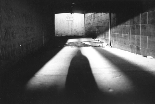
I've recently purchased a book about his work (from a really excellent art book supplier) and it's very interesting reading. . . I hadn't realised that Gill was the sculptor who was commissioned to carve the friezes on Broadcasting House (but, only this summer, when I was not dating the "date" who dumped me, I spent a lot of time admiring them) (he was an announcer for Radios 3 and 4, you see, and I used to wait on the steps of All Souls, Langham Place, admiring the BH building, while he finished his shift) (ho hum!)

Ariel
the invisible spirit of the air,
listening to celestial music
Broadcasting House
the invisible spirit of the air,
listening to celestial music
Broadcasting House
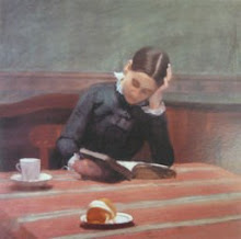
Gill also produced lots of sketches and wood cuts (more things I like). . .

Mother and Child
 Girl on Grass
*
anyhow, back to the typeface. . . what I hadn't realise before was that Gill was originally commission to design a serif typeface, but that was put on hold when it was realised that what was actually needed was a sans-serif face - which is when Gill Sans was designed. . .

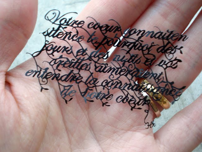
this is a great way of admiring the font, by looking at the wooden type:

and I love discovering how these things come about:

and what I also didn't realise until now was that the serif font he designed was actually Perpetua. . .
 Perpetua. . . it's also lovely, isn't it. . .
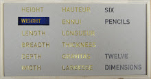
let's compare them, shall we?Perpetua. . . it's also lovely, isn't it. . .
Gill Sans:
Perpetua:Gill Sans:(I'll stop there, for the sake of your sanity) (I don't have any left, clearly)


9 comments:
I didn't know Eric Gill did all those things! I knew a bit about the typeface designing because my step father went through a period of admiring him a lot and found a book written by his daughter which he liked.
I love the wood cuts.
Perpetua is very pretty and unfussy. I seem to remember reading that Gill was quite dogmatic about his typefaces and particularly despised any extraneous decoration.
I have all these art books on the shelves, but something about this one made me want to read it!
the bookshop guy told me that Mr Gill was rather odd (something to do with his daughter. . . can't bring myself to even write it) so it was interesting to hear about the book your father had
(-:
XXX
Very good. A history, biography lesson here for the reading. So many subjects out there in the world, (No, not your royal subjects like Viscus and Dave), One can never stop learning.
Nice job I, Like The View.
Peace to all.
PS I like Georgia. Who made that one?
Georgia is a typeface that provides clarity at low resolutions on the screen. The author, Matthew Carter, has successfully managed to create a typeface family which combines high legibility with character and charm. It contains all the characters necessary to typeset Eastern European languages, in addition to the Greek and Cyrillic scripts. The Georgia font is preinstalled by default on Apple Macintosh and Windows-based computers.
More Peace to all
Suppose he could type out the Llama song in that font?
Just askin'.....
Yaknow--they are pretty. And go figure he who makes angels makes angelic lettering......
What's the Llama song?
Oh no ya don't--he's just doing that cuz he doesn't know the Birdie Song!!
Ohhhhhhh.... *pauses*
Nope. Not singing it and you can't make me!
(mind you, those were close to The Brit's words last night when he stood at the doorway, glared at me and drummed his fingers on the doorway's frame--)
*laughing*
Oh and there are several lines yet to be learned. :-/
Ya'll oughta feel sorry for him....
To say that Eric Gill was a bit odd is quite an understatement. His personal story is enough to make you never want to use the typeface again. A backlash against it in design-conscious Sweden was enough to prompt a major charity organization to change its logo. Check it out here:
http://kcomposite.blogspot.com/2009/10/fontroversy.html
or here:
http://www.thelocal.se/blogs/snuggling/2009/10/15/fontroversy/
Post a Comment